Working with Images

It is easy to upload images to your website using the Media screen.

The TinyMCE Content Ediitor included with the Core Joomla! CMS also enables you to quickly upload and insert images into Articles and Custom Modules.

Media Screen

Select the Media button from the Site panel in your website's Dashboard to begin uploading media files including images and PDFs.

articles

Read more: Working with Media.

Content Editor

After uploading images you can then insert them into any given Article using the Content Editor.

The image below shows the TinyMCE editor panel as configured in a default WYNCHCO Website Design.
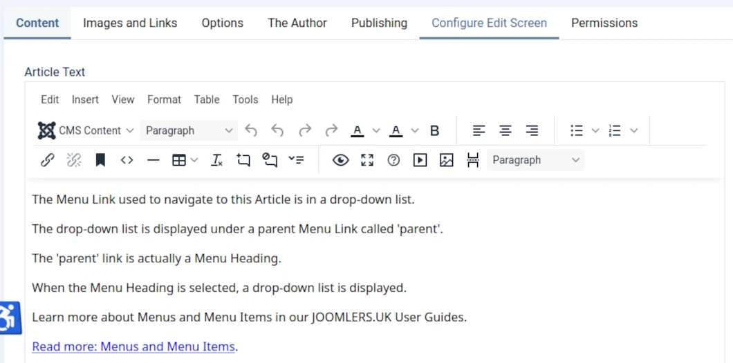
TinyMCE Editor

Read more: Content Editors.

Image size, format, class and attribute

Image size

You can upload images of any size to your website.

But it makes sense to size an image according to need.

By size we mean both dimensions (pixels or PX) and memory (kilobytes or Kb).

Image file format

As a general rule the WebP file format will result in the smallast pixel size for any given image.

Image class

Be aware that you can display several versions of the same image in an Article (or Custom Module).

And assign each version a Custom Style Set to determine when it will be displayed in response to the device and screen size used by website visitors.

Read more: Use Custom Style Sets to control when images are displayed.

Image attribute

As a general rule loading="lazy" should be used to delay loading of images until the website visitor scrolls down the 'web page'.

Use loading="eager" when an image is to be displayed at the top of a 'web page'.

Purpose: improve page load speed.

We follow these rules when publishing images in our websites

Images not intended for display on key landing pages

As a general rule we publish only one version of an image.

The image version dimensions will reflect whether or not a sidebar is to be displayed.

  • 800px wide: when one sidebar is displayed.
  • 1060px wide: when no sidebars are displayed.

Images intended for display on key landing pages

As a general rule we publish three versions of an image.

The image version dimensions will be as follows.

  • 340px wide: for display on phone screens.
  • 580px wide: for display on tablet screens (in portrait view).
  • 800px or 1060px wide: for display on larger screens including tablet screens (in landscape view).

Image file format

As a general rule we display images in our websites using the WebP format.

Reason: image size is usually smaller than other formats such as JPG, GIF or PNG, and without loss of quality.

Result: faster page load and improved website performance on mobile devices.

Image Attribute

As a general rule we assign loading="lazy" as the default loading attribute for all image versions in our website.

We assign loading="eager" when using PageSpeed Insights we identify that to do so will improve page load speed on mobile devices.

Images version name

We size images on our device before uploading them to our websites.

When we do we add a suffix to each image to denote its size.

For example: for an image called apple.webp, we would upload three versions named:

  • apple-340.webp
  • apple-580.webp,
  • apple-800.webp or apple-1060.webp.

Image version class

When inserting several versions of an image in an article, we assign a custom class (or style set) an image version to determine when it will be visible in our website.

Result: no one version of an image will be displayed on screen at the same time as any other.

For example: we assign the 'phone' class (or style set) to a 340px wide image.

Read more: Working with Images.

Working with Images

It is easy to upload images to your website using the Media screen.

The TinyMCE Content Ediitor included with the Core Joomla! CMS also enables you to quickly upload and insert images into Articles and Custom Modules.

Media Screen

Select the Media button from the Site panel in your website's Dashboard to begin uploading media files including images and PDFs.

articles

Read more: Working with Media.

Content Editor

After uploading images you can then insert them into any given Article using the Content Editor.

The image below shows the TinyMCE editor panel as configured in a default WYNCHCO Website Design.

TinyMCE Editor

Read more: Content Editors.

Image size, format, class and attribute

Image size

You can upload images of any size to your website.

But it makes sense to size an image according to need.

By size we mean both dimensions (pixels or PX) and memory (kilobytes or Kb).

Image file format

As a general rule the WebP file format will result in the smallast pixel size for any given image.

Image class

Be aware that you can display several versions of the same image in an Article (or Custom Module).

And assign each version a Custom Style Set to determine when it will be displayed in response to the device and screen size used by website visitors.

Read more: Use Custom Style Sets to control when images are displayed.

Image attribute

As a general rule loading="lazy" should be used to delay loading of images until the website visitor scrolls down the 'web page'.

Use loading="eager" when an image is to be displayed at the top of a 'web page'.

Purpose: improve page load speed.

We follow these rules when publishing images in our websites

Images not intended for display on key landing pages

As a general rule we publish only one version of an image.

The image version dimensions will reflect whether or not a sidebar is to be displayed.

  • 800px wide: when one sidebar is displayed.
  • 1060px wide: when no sidebars are displayed.

Images intended for display on key landing pages

As a general rule we publish three versions of an image.

The image version dimensions will be as follows.

  • 340px wide: for display on phone screens.
  • 580px wide: for display on tablet screens (in portrait view).
  • 800px or 1060px wide: for display on larger screens including tablet screens (in landscape view).

Image file format

As a general rule we display images in our websites using the WebP format.

Reason: image size is usually smaller than other formats such as JPG, GIF or PNG, and without loss of quality.

Result: faster page load and improved website performance on mobile devices.

Image Attribute

As a general rule we assign loading="lazy" as the default loading attribute for all image versions in our website.

We assign loading="eager" when using PageSpeed Insights we identify that to do so will improve page load speed on mobile devices.

Images version name

We size images on our device before uploading them to our websites.

When we do we add a suffix to each image to denote its size.

For example: for an image called apple.webp, we would upload three versions named:

  • apple-340.webp
  • apple-580.webp,
  • apple-800.webp or apple-1060.webp.

Image version class

When inserting several versions of an image in an article, we assign a custom class (or style set) an image version to determine when it will be visible in our website.

Result: no one version of an image will be displayed on screen at the same time as any other.

For example: we assign the 'phone' class (or style set) to a 340px wide image.

Read more: Working with Images.

By browsing our website you agree to its use of cookies. Cookie Policy.