

It's easy with a WYNCHCO Template Design

A WYNCHCO Template Design makes a website look great regardless of device and screen size.
A WYNCHCO Template Design comprises:
- three Style Sheets,
- dozens of Custom Styles organised into groups,
- each of which can be changed in an instant via the website Dashboard,
putting control of your website's Look & Feel at your finger tips.
A WYNCHCO Template Design makes it easy to change the appearance of your website with just a few mouse clicks.
Custom Styles
Each group of Custom Styles can be changed via your website's Dashboard.
Change look and feel with just a few simple clicks.
Website Width
Fixed width (fill the screen width only on small screen devices).
Full width (fill the screen width on all devices).
Back to Top Arrow
Display: Yes or No.
Background colour.
Foreground colour.
Buttons
Background colour and opacity.
Text colour.
Corner radius.
Tabs and Sliders
Background colour and opacity (when active).
Text colour (when active).
Copyright Statement
Show/hide statement.
Change statement.
Text colour.
Images
Corner radius.
Apply image filter (full colour, grayscale or sepia).
Input Boxes
Corner radius.
Keyboard Focus Indicator
Change colour on focus for keyboard users.
Includes background colour of input field on focus for all users.
Login Credentials
Show or hide Username Reminder and Password Reset Links in Front End.
Separately change Screen with just a few simple clicks:
- Landscape view.
- Portrait view.
Background Colour
Start colour.
End colour.
Gradient height.
Background Image
Display: Yes or No.
Display separate image in:
- Landscape view.
- Portrait view.
Select the image.
Position the image:
- Top-left.
- Top-right.
- Middle.
Repeat the image:
- Yes - Horizontal & vertical.
- Yes - Horizontal.
- NO.
Fill screen: Yes or No.
Fix screen: Yes or No.
Separately change Brand with just a few simple clicks:
- Landscape view,
- Portrait view.
Brand Background
Start colour.
End colour.
Top and bottom margin.
Top & bottom padding.
Corner radius.
Logo Image
Display logo: Yes or No.
Display either:
- SVG image, or
- JPG, GIF, PNG image.
Display different logo image in:
- Landscape view.
- Portrait view.
Padding.
Corner radius.
Bottom margin.
Site Title and Strapline
Display Site Title and Strapline in:
- Landscape view,
- Portrait view, or
- Both.
Site Title text.
Strapline text.
Strapline URL.
Padding.
Text weight (normal or bold).
Text colour.
Brand Modules
Display Brand Modules: Yes or No.
Adjust vertical position.
Same or different padding on devices in Portrait or Landscape view.
Image corner radius.
Change look and feel with just a few simple clicks.
In Portrait View, show/hide a Header image above the:
- Top Menu, or
- Menu
using either SVG, JPG, GIF or PNG format.
Header Link
URL.
Link Title Attribute.
Separately change the Container, Main Body and Brand with just a few simple clicks:
- Landscape view,
- Portrait view.
Container
Background colour and opacity.
Gutters, padding and row-gap of Container positions.
Main Body
Gutters, padding and row-gap of Main Body positions.
Base
Background colour and opacity.
Gutters, padding and row-gap.
Change look and feel with just a few simple clicks.
Globally assign a View to all Modules published in a Template Position.
Options are:
- Landscape.
- Portrait.
- Both.
Example: Sidebar-Right Position
If the globally assigned View is Landscape then all Modules published in this Position will only be visible in landscape view.
In other words, when the website is viewed on large screen devices and tablets (landscape view).
But not on smartphones and tablets (portrait view).
Example: Breadcrumbs Position
- Above Articles.
- Below Articles.
- None.
Change look and feel with just a few simple clicks.
Assign a Card to a Position to change look and feel of Modules displayed in that Position.
Separately assign any one Card to any one Template Position:
- Top-a.
- Top-b.
- Sidebar-left.
- Sidebar-right.
- Main-top.
- Main-bottom.
- Bottom-a.
- Bottom-b.
- Base.
Custom Cards
Display the Default Card or one of three pre-configured CUSTOM Cards:
- Custom1 (Light Grey).
- Custom2 (Dark Grey).
- Custom3 (Black).
Change look and feel of Custom Cards.
Add more Custom Cards. Example: Custom4(Red).
We show you how in our Joomla! User Guide.
Default Card
Change look and feel with just a few simple clicks.
Background colour and opacity.
Title background colour and opacity.
Title text colour.
Title indentation.
Text and borders colour.
Corner radius.
Increase padding.
Link colour.
Button background colour and opacity.
Button text colour.
Change look and feel with just a few simple clicks.
Choose for each Position listed below whether to display Modules in 1 or 2 Columns.
Large Screen Devices
Sidebar-right Position.
Tablets
Sidebar-right Position.
Base Position.
Phones
Sidebar-right Position.
Base Position.
Change look and feel with just a few simple clicks.
Text and borders colour.
Heading colour.
Link colour.
Separately change look and feel with just a few simple clicks of:
Horizontal Menus
Link background colour.
Link text colour.
Link border colour.
Vertical Menus
Link background colour.
Link text colour.
Menu corner radius.
Menu padding.
Brand Menu
Link text colour.
Link alignment: left, right, centred or justified.
Change look and feel with just a few simple clicks.
Navbar background colour.
Menu Links
Background colour.
Border colour.
Link background colour.
Link text colour.
Link border colour.
Sub Menu Links
Sub Menu Link width (in Landscape view).
Bottom Menu Navbar
Choose either of two formats:
- Text + Background (same as other Navbars).
- Text Only.
Change look and feel with just a few simple clicks.
Change Text Size for each category listed below:
- Prose (Button, Div, Input, Paragraph, Slider, Tab and Tags text).
- Breadcrumbs.
- Copyright.
- Headings.
- Menu Links.
- Navbar Menu Links.
Change Letter Spacing of all text.
Text Size on smaller screens can be quickly changed using a well-signposted USER.CSS style sheet.
Change look and feel of Links:
- Font Weight and Underline.
- Underline on Hover.
Font Weight and Underline can be separately controlled:
- Articles & Custom Modules.
- Menu Links.
- Menus.
- Navbars.
Change look and feel with just a few simple clicks.
Separately change the Google FONT Family for each main website element:
- Prose,
- Buttons,
- Headings,
- Menu Links,
- Navbar Links,
- Site Title,
- Strapline.
Add more Google Fonts.
Add traditional Web Safe Fonts.
We show you how to add and change Fonts in our Joomla! User Guide.
About Google Fonts
In WYNCHCO Website Designs, Google Fonts are Self-hosted.
Benefits of Self-hosted Google Fonts
Browsers do not need to make remote calls to the Google server every time a website page loads.
Faster page load times help improve search engine marketing performance.
Improved page load times help improve user experience.
Risk of non-compliance with GDPR regulations is reduced.
See how easy it is to change Look and Feel
A WYNCHCO Template Design enables you to change your website's Look and Feel in just a few simple mouse clicks.
Simply sign into your website's Dashboard and follow these steps.

Example.

Example: Site.

Example: Website Width.
Toggle between Fixed Width and Full Width to change the width of your website in the browser of large screen devices.

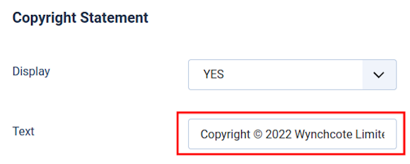
Example: Copyright Statement.
To display a simple Copyright Statement at the bottom of your website simply select Display = Yes.
And enter the text you wish to be displayed.
Work smarter not harder!
We coach, help and support managers of businesses and organisations across Cheshire, Manchester, Merseyside, North West England and the UK.
 Call 0161 818 8228 for Joomla! CMS Help & Support
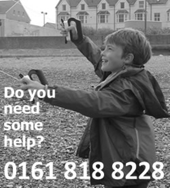 Contact us for Joomla! CMS Help & Support
 Use DuckDuckGo® when you search the web